Recordings
https://twinlens.app/compare?share=c13c036501ed&embed=1
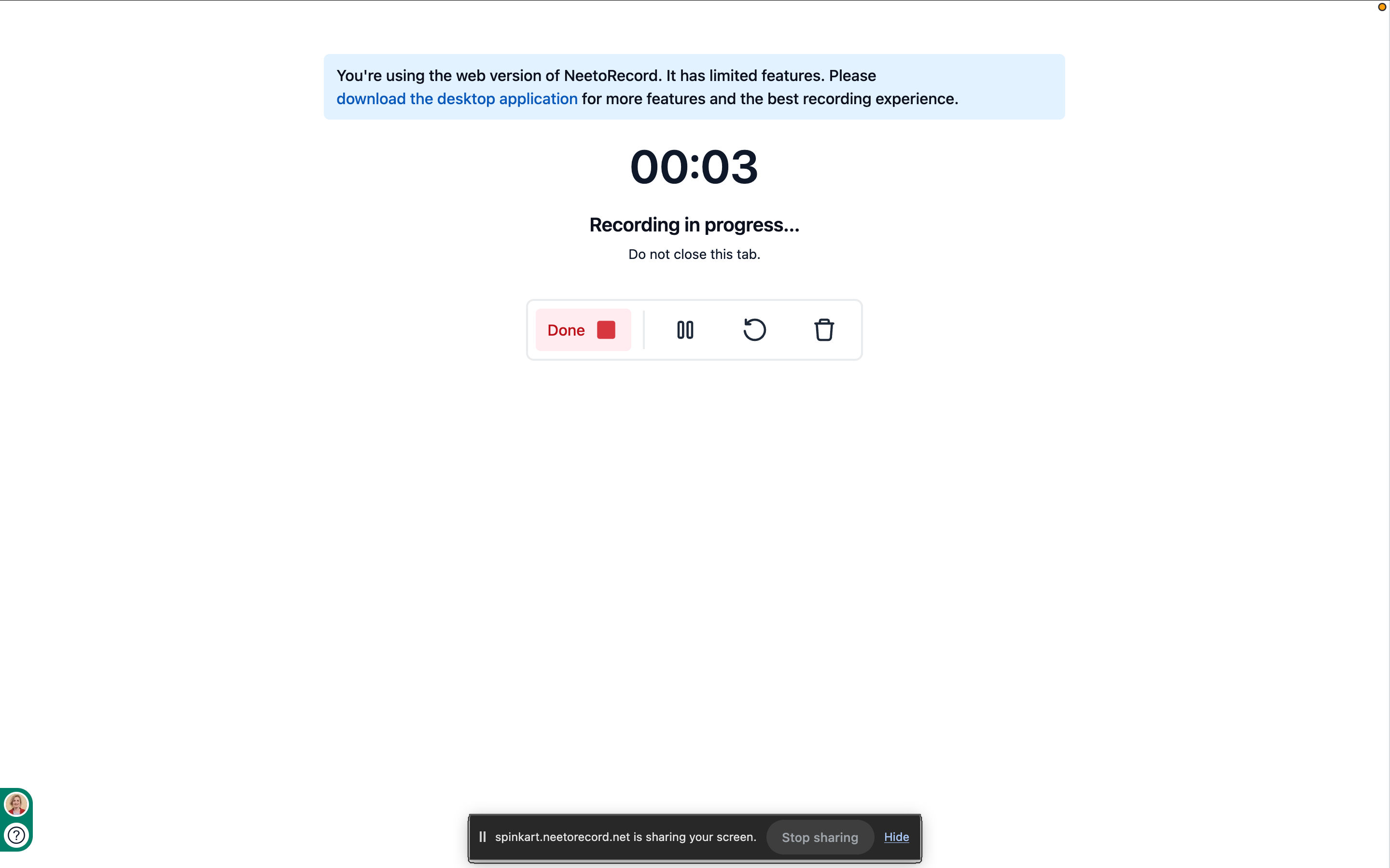
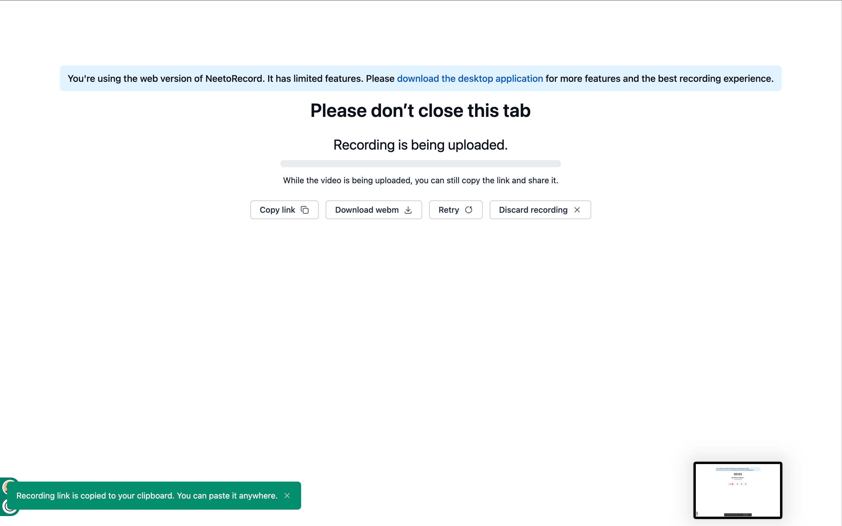
Removed the repeating "web version has limited features" warning from multiple screens.
Refined the overall visual hierarchy using a balanced combination of muted and high-contrast text.
Applied consistent rounded corners across recording cards and folders.
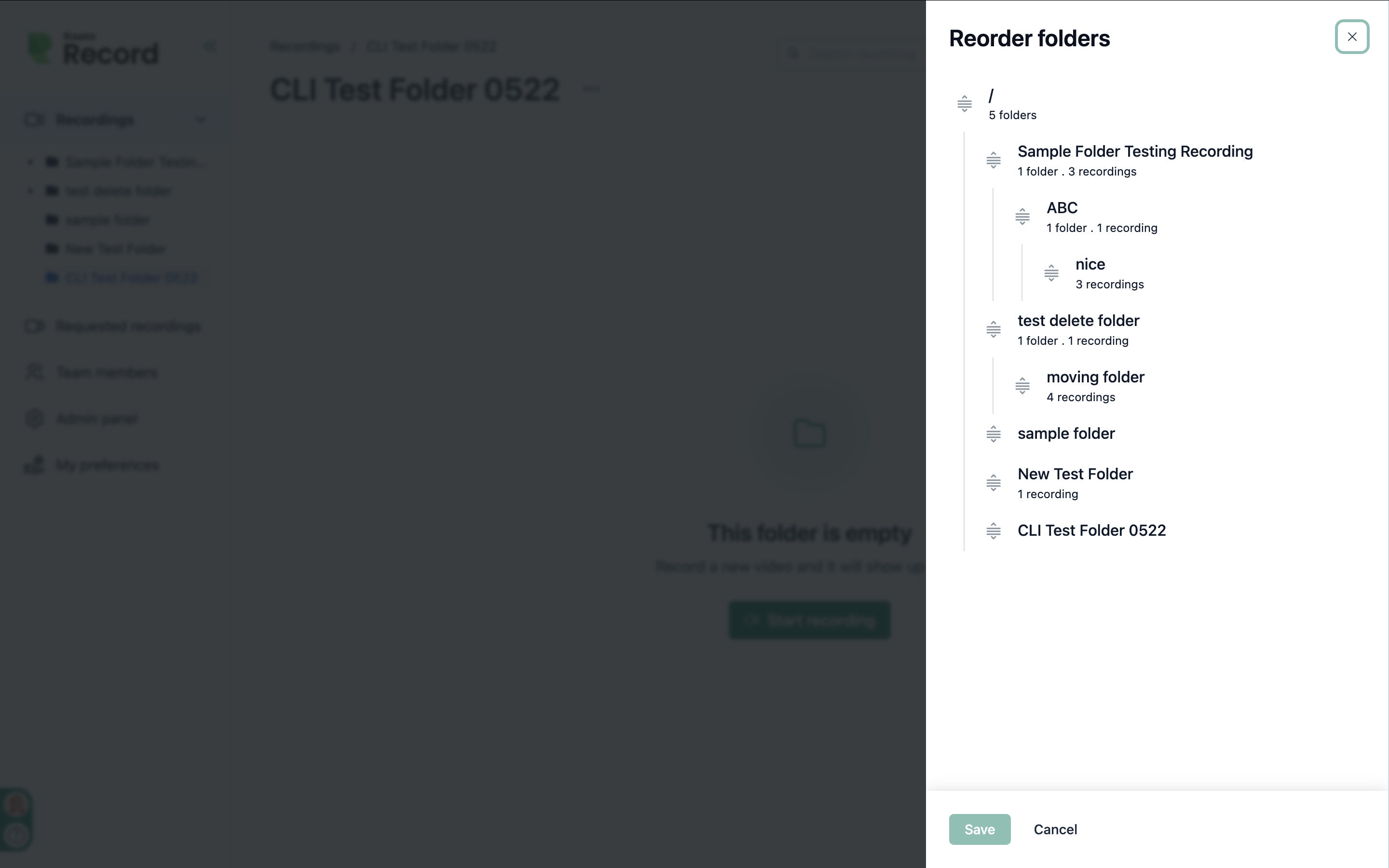
Redesigned the folder tree with improved hierarchy and readability.
Standardized tree hover and active states to match the Shadcn Sidebar component.
Copy-link button in the table view now appears on row hover, keeping the Title column clean.
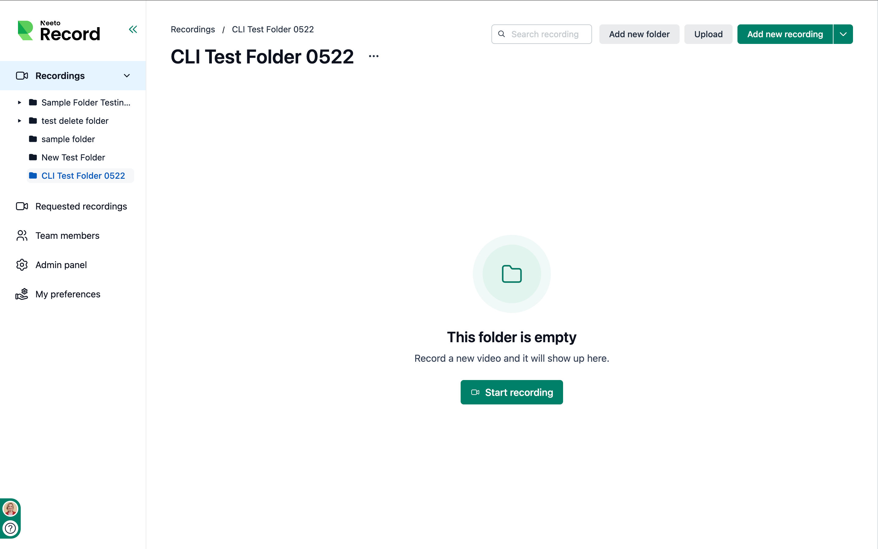
Standardized empty states on the neeto-atoms Empty component and removed the unwanted overrides on NoData screens. https://spinkart.neetorecord.net/admin/recordings/folders/bky9fj8?view=card
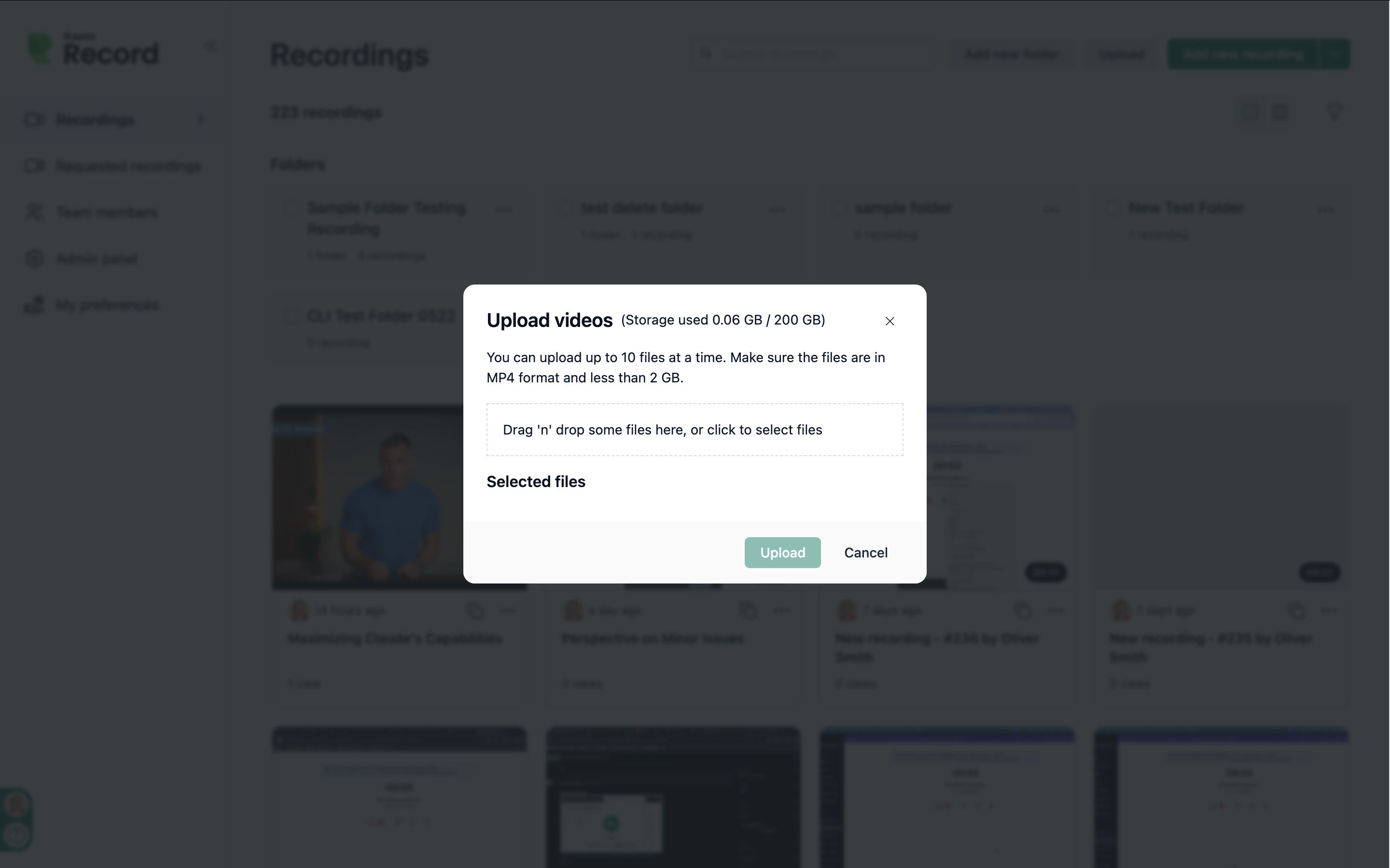
Redesigned the file-upload dropzone. https://twinlens.app/compare?share=02c79c1cfa48&embed=1
Replaced the custom-built Upload / Choose-from-video buttons with standard design-system (neeto-atoms) Buttons — consistent styling, states, and focus behavior for free.
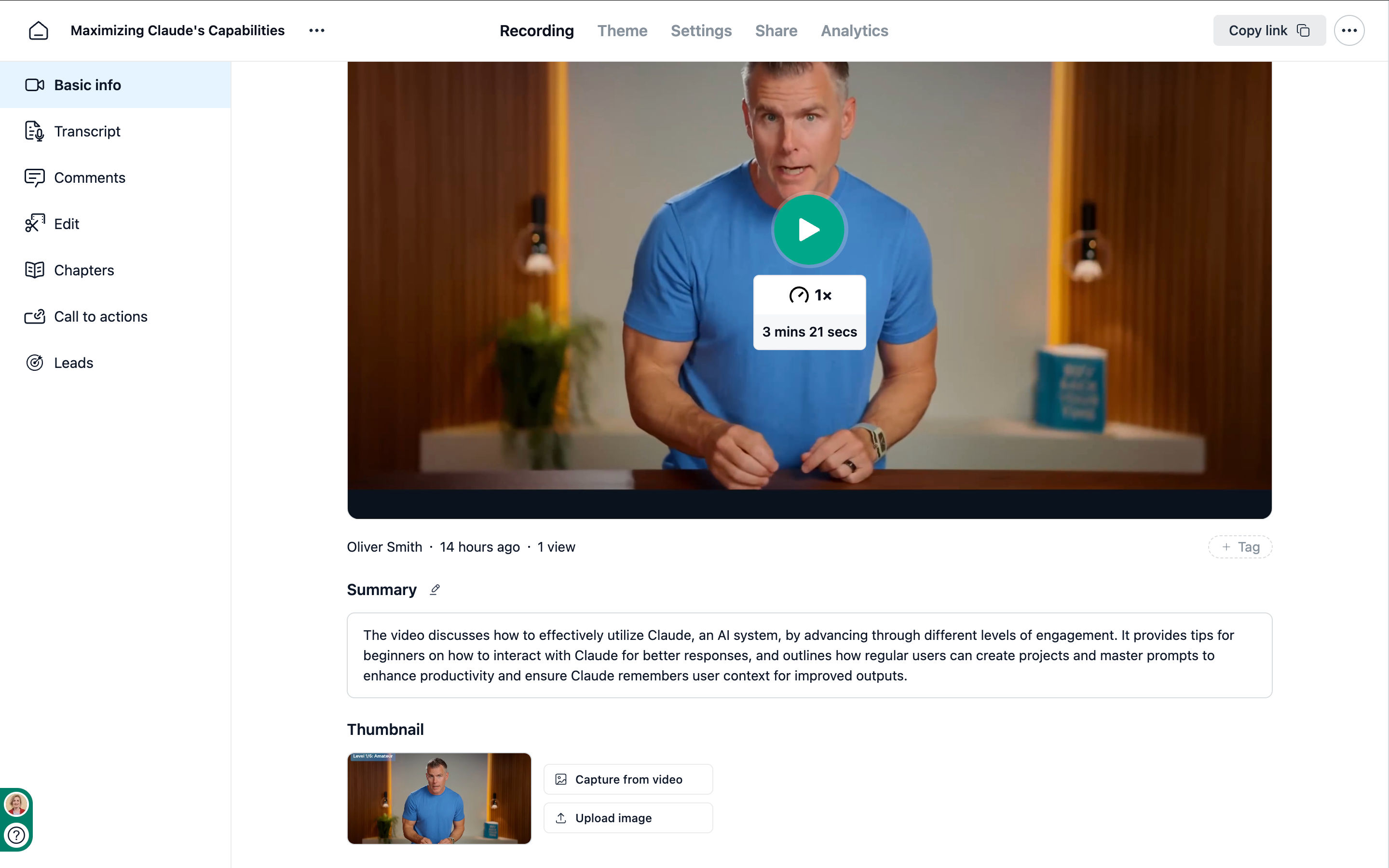
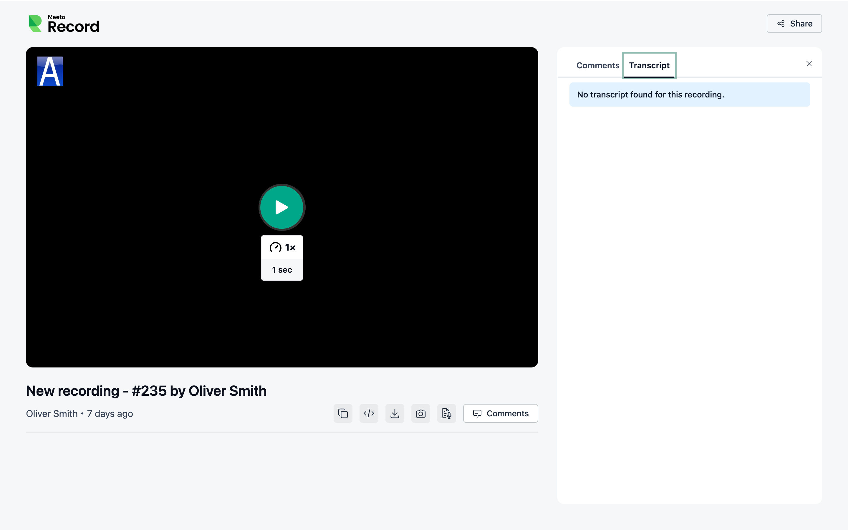
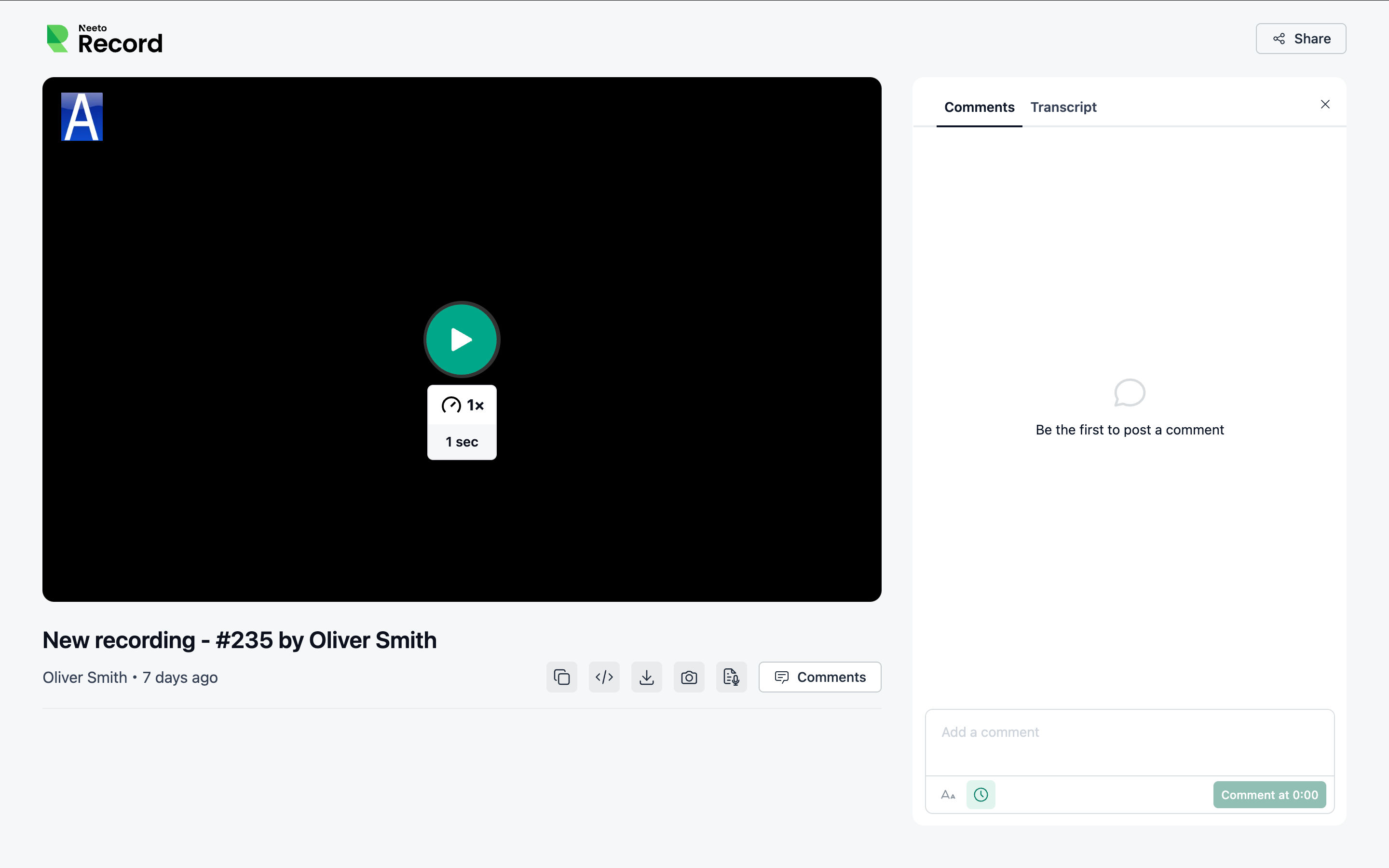
Polished the Transcript, Comments, and Chapters panels.
Replaced the confusing warning-plus-spinner state in chapter generation with a single progress spinner, and added a Sparkles icon to the Generate-using-AI button. https://spinkart.neetorecord.net/admin/recordings/8bd49f0d-ad2d-4936-b0b4-6a931bf63988?view=chapters
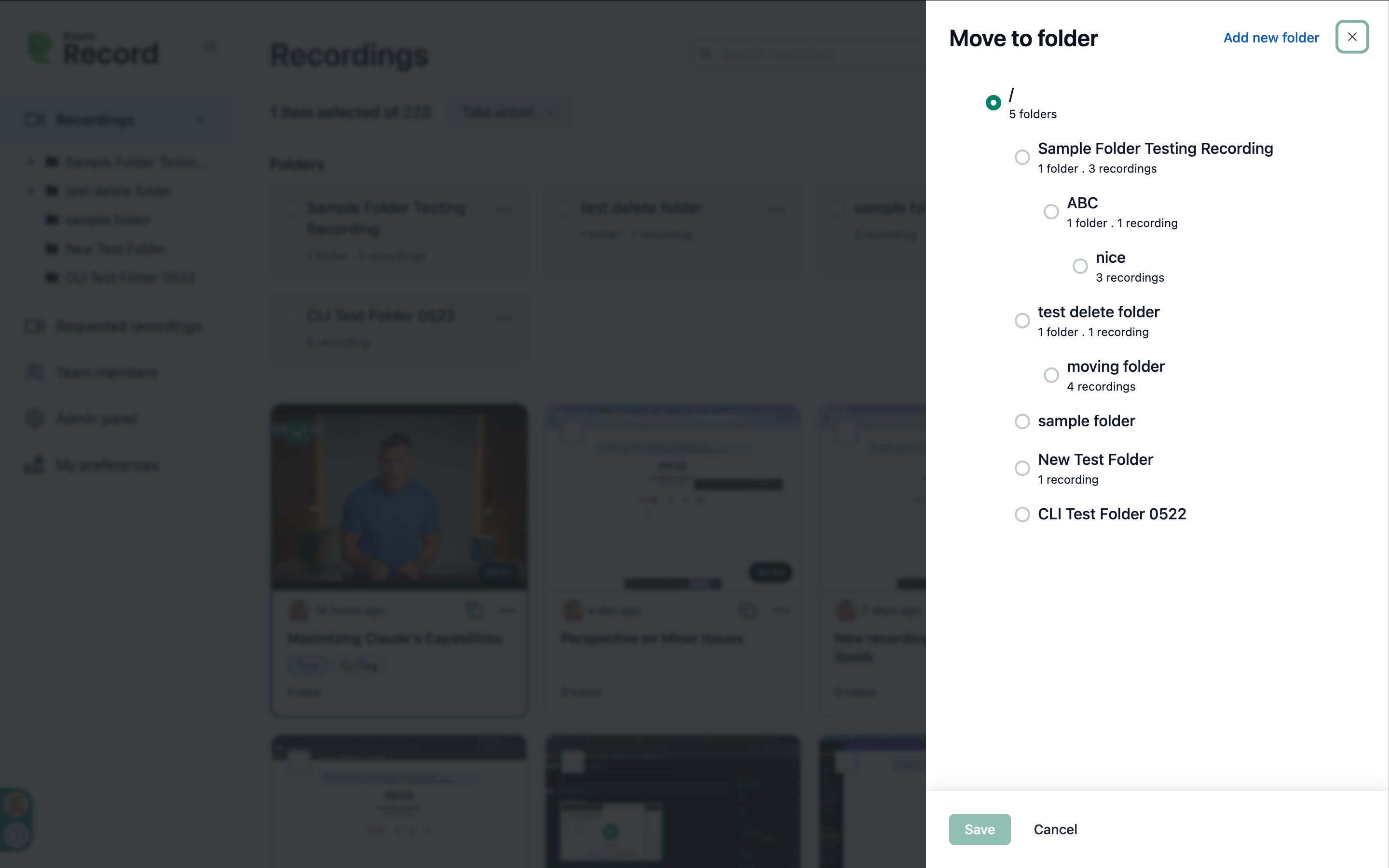
Improved the share and embed screens — clearer option-card hierarchy (larger titles) and wider sheets for the move-to-workspace and request-recording flows.
Evened out spacing and removed redundant card titles across the Settings pages.
Reduced visual clutter and improved overall consistency with the shadcn design system.
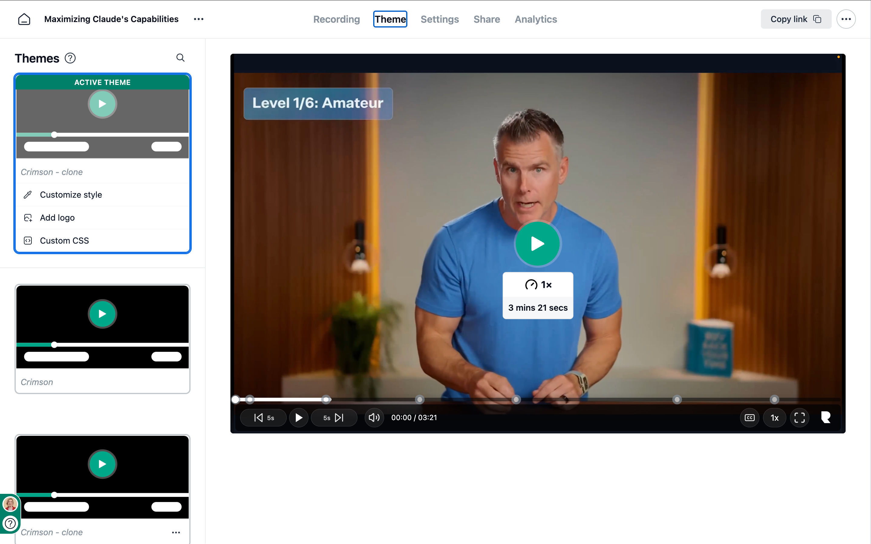
Theme builder sidebar (themes-nano)
Refined theme cards. https://twinlens.app/compare?share=9ffadb134912&embed=1
More compact quick-action rows with muted icons.
Fixed the theme thumbnail bleeding past the card's rounded border — content is now properly clipped to the card corners.
Used the standard Label component for the field labels.
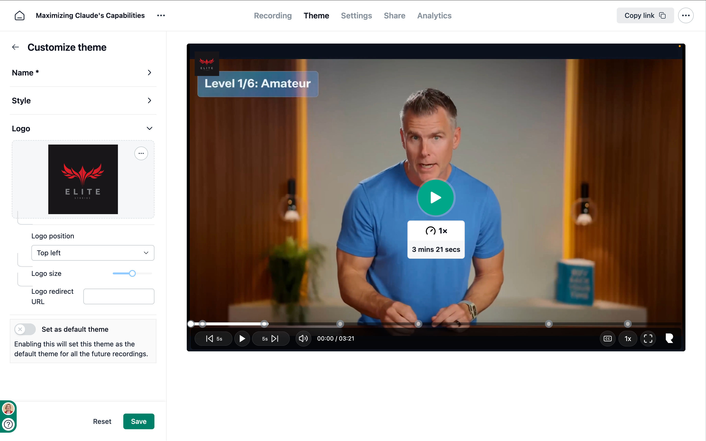
Fixed UI issues in the logo section and fine-tuned it. https://twinlens.app/compare?share=84526b6d9be1&embed=1
Public page
http://spinkart.lvh.me:8790/watch/1c76aa3c07b67231c161
https://spinkart.neetorecord.net/admin/recordings/bd3541d0-603c-4ac4-a0b7-08ac0ce8dec0
https://twinlens.app/compare?share=64f5a5fc9900&embed=1
https://twinlens.app/compare?share=39597753e20c&embed=1
Prioritized the Play button by reducing the visual weight of seek controls.
Replaced custom player icons with Lucide icons for improved consistency.
Grouped video actions into a single button group.
Updated the Comments / Transcript switch to a modern tab design.
Improved spacing and alignment throughout the Transcript and Comments panels.
Standardized empty states using the
EmptyStatecomponent from neeto-atoms.Reduced visual clutter across the interface.
Capped the public branding logo width so wide logos no longer break the header.