
Introduction
Responsive design is fundamental to modern web development, as users access websites from a variety of devices with varying screen sizes. At neetoSite, a website-building tool by neeto, we strive to ensure a great user experience on all devices. In this blog post, we share our journey of implementing responsive typography, padding, and margin using the RFS package.
The issue
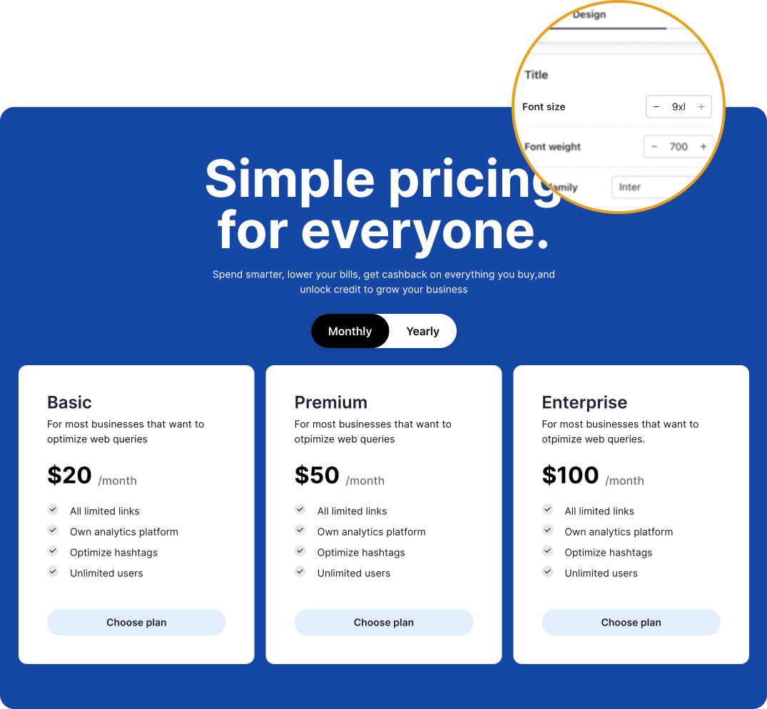
At neetoSite, users can personalize font sizes from the design page. If a user selects the largest font size (9xl) for the title, everything looks flawless on the desktop view. However, when switching to mobile, things start to look a little off. The title appears out of place, and that's because we had been using the same font size for both views. Our journey began with this challenge: the absence of responsive typography.
Desktop view
Mobile view

Limitations of the Tailwind approach
Under the hood, we were utilizing Tailwind CSS for neetoSite building blocks, and one possible solution was to leverage Tailwind's responsive classes for implementing typography that adapts to different screen sizes.
<p class="text-sm md:text-base lg:text-xl xl:text-2xl">Responsive Text</p>With over 50 building blocks to manage, this approach of manually setting responsive Tailwind classes for each component was impractical due to maintenance and consistency challenges.
The solution: RFS package
What is RFS?
Bootstrap’s side project RFS is a unit resizing engine which was initially developed to resize font sizes (hence its abbreviation for Responsive Font Sizes). It's a great tool for creating responsive typography and layouts, as it automatically calculates the appropriate values based on the dimensions of the browser viewport. Nowadays, RFS is capable of rescaling most CSS properties with unit values like margin, padding, border-radius, or even box-shadow.
Using RFS
The rfs() mixin has shorthands for font-size, margin, margin-top, margin-right, margin-bottom, margin-left, padding, padding-top, padding-right, padding-bottom, and padding-left. See the example below for source Sass and compiled CSS.
.title {
  @include font-size(4rem);
}
Generated CSS
.title {
  font-size: calc(1.525rem + 3.3vw);
}

@media (min-width: 1200px) {
  .title {
    font-size: 4rem;
  }
}
Visualisation
If you wonder how the values are rescaled, wonder no more and stare at this graph which might clarify things a bit:
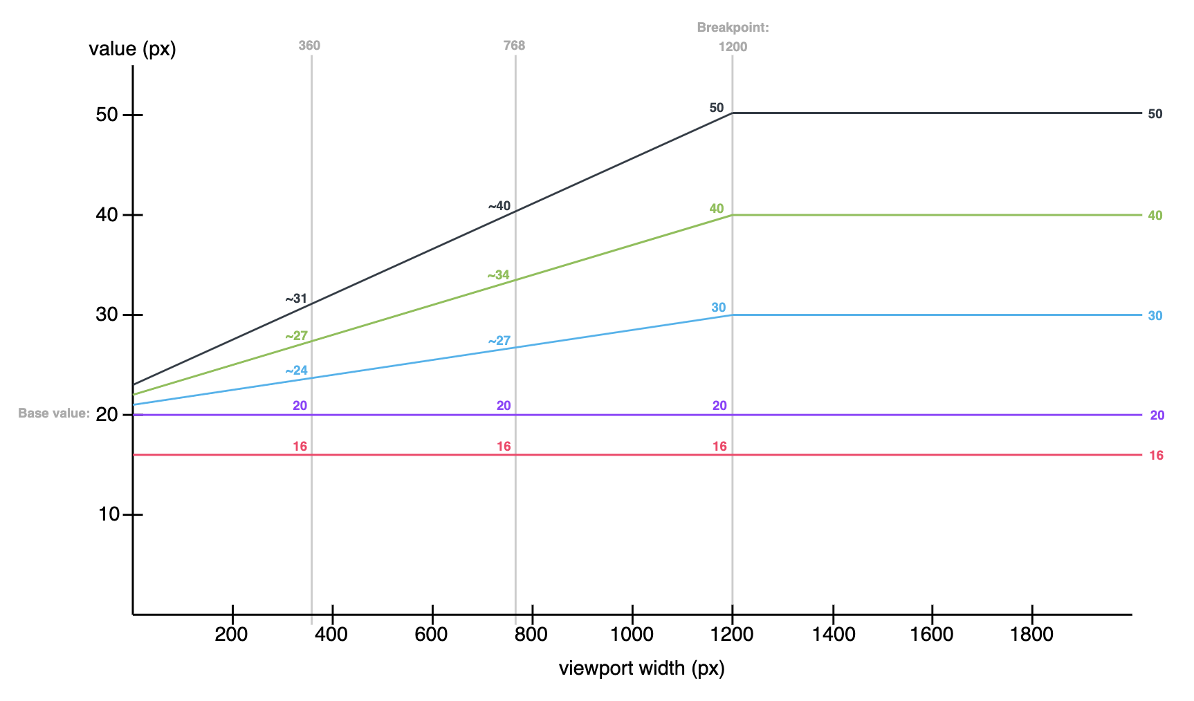
Each color represents another value being rescaled. For example:
.title {
  @include font-size(40px);
}
This is the green line. A font size of 40px stays 40px in viewports with a size larger than 1200px. Below 1200px, the font size is rescaled and at viewport of 360px, the font size is about 27px. Note that every font size is generated in a combination of rem and vw units, but they are mapped to px in the graph to make it easier to understand.
How we applied RFS on neetoSite
We created custom CSS classes for each font size variant, padding, and margin, and applied RFS to them. RFS automatically calculates the appropriate values based on the browser viewport, so the layout scales down pleasingly.
Font size
.ns-font-xl {
  @include font-size(1.25rem !important);
}

.ns-font-2xl {
  @include font-size(1.5rem !important);
}

.ns-font-3xl {
  @include font-size(1.75rem !important);
}

.ns-font-4xl {
  @include font-size(2rem !important);
}

.ns-font-5xl {
  @include font-size(2.25rem !important);
}

.ns-font-6xl {
  @include font-size(2.5rem !important);
}

.ns-font-7xl {
  @include font-size(3rem !important);
}

.ns-font-8xl {
  @include font-size(3.75rem !important);
}

.ns-font-9xl {
  @include font-size(4.5rem !important);
}

...
RFS fluid rescaling in action
.gif)
How RFS transformed neetoSite
Improved mobile responsiveness: With RFS, we were able to effortlessly set responsive font sizes, paddings, and margins for different screen sizes, ensuring a seamless and visually pleasing experience across devices.
Simplified user customization: Users could continue customizing font sizes, but now with the added benefit of automatic responsiveness, eliminating the burden of setting tablet and mobile values manually.
Enhanced readability: RFS helps ensure that your text remains readable at all screen sizes.
Improved consistency: The use of RFS ensures that the typography, padding, and margin of all neetoSite blocks are consistent across all devices. This is because it scales all of the padding and margin values based on the same formula."

Keen to witness RFS in action?
Take a look at BigBinary Academy, a place to learn coding powered by neetoSite. Recent changes have brought about a significant improvement in mobile responsiveness, and our commitment to further enhancements continues. Another shining example of successful RFS implementation can be found at https://neetocode.com, a free coding platform by BigBinary.
Happy coding ❤️