neetoChat inbox page - 13 inch monitor
Existing UI vs. new UI
-
Space utilisation
In the existing UI, all the blocks have enough space to showcase their respective content..png)
-
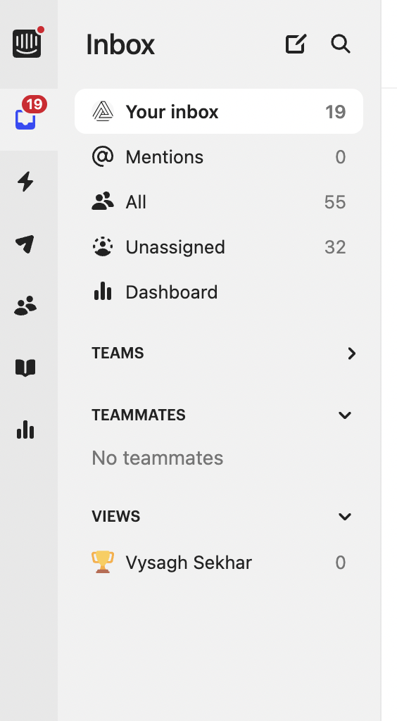
Scrolling inside Sidebar
In the current UI, the views are displayed in the following manner. We have incorporated "See less/See more" buttons to hide or reveal the available views. This approach is scalable even when there are numerous views in the existing UI, and scrolling within this UI does not pose any issues.
In the new UI, if there is a large number of views, vertical scrolling will be required within the Sidebar. As a result, accessing the links below it may become challenging.
To illustrate, let's consider the example of Spinkart, where we have approximately 12 items in the views. In such cases, the new UI will require scrolling within the Sidebar to access the bottom section. To resolve this issue, we might need to make the bottom profile section sticky, ensuring it remains fixed at the bottom of the Sidebar. This approach will result in internal scrolling within the top section of the Sidebar.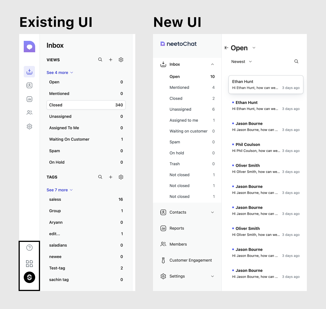
-
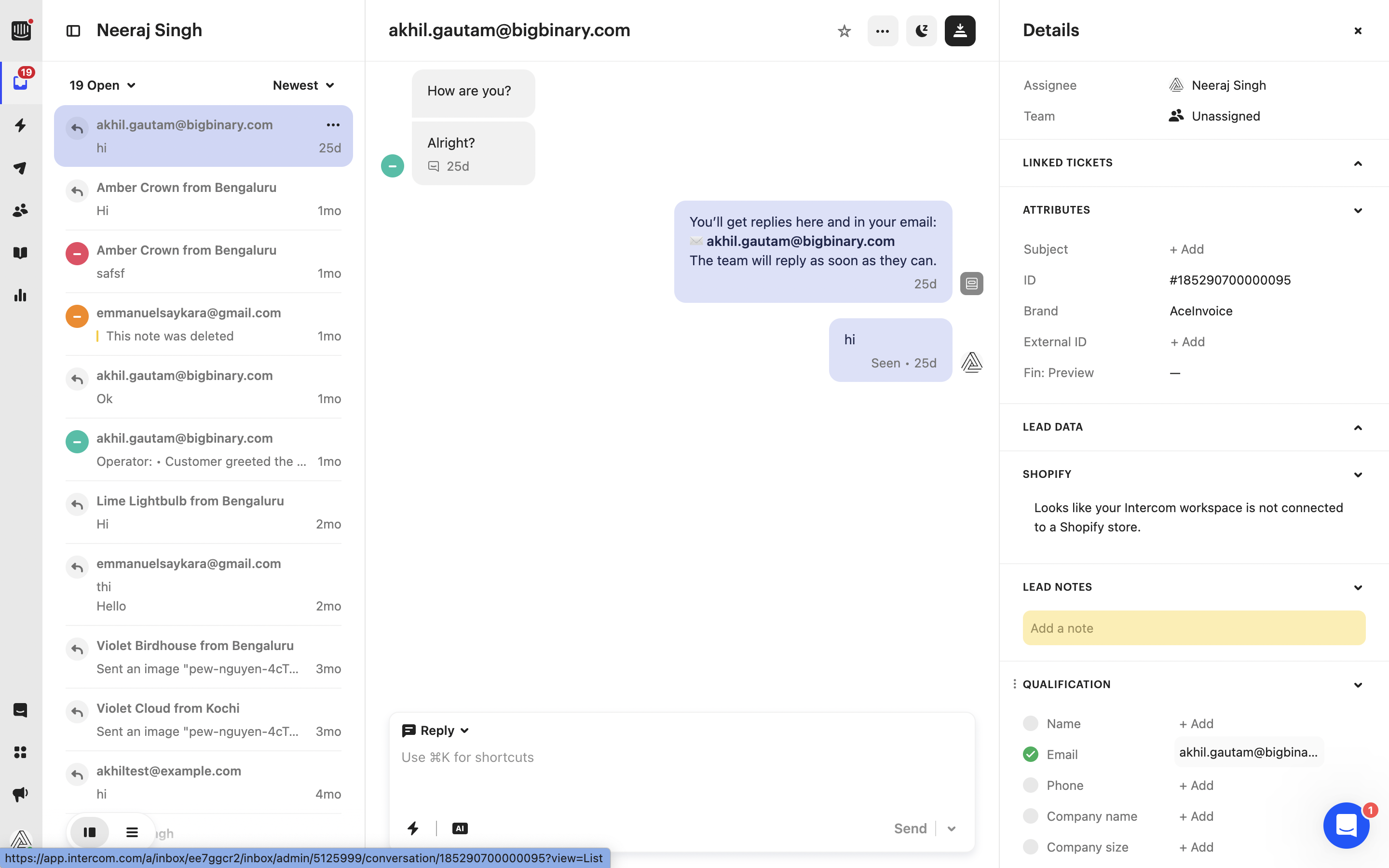
Accessibility
From what I understand, the main purpose of the UI revamp is to address the issue of primary filters being inaccessible. Some users have had difficulty opening the Menubar and accessing the primary filters. But in the collapsed state of the new UI, both the Sidebar links and primary filters are hidden, which means users need to figure out how to exit the screen..png)
-
Scalability
In the existing UI, we have various functionalities such as searching within views, adding new views, and accessing the settings page. Additionally, we have the ability to display additional information, like tags. Moreover, if we plan to support teams in the future, we can effectively utilize this area, similar to how Intercom does. However, with the Sidebar approach, we are unable to provide these options. Therefore, the existing UI is more scalable compared to the new approach..png)
Intercom
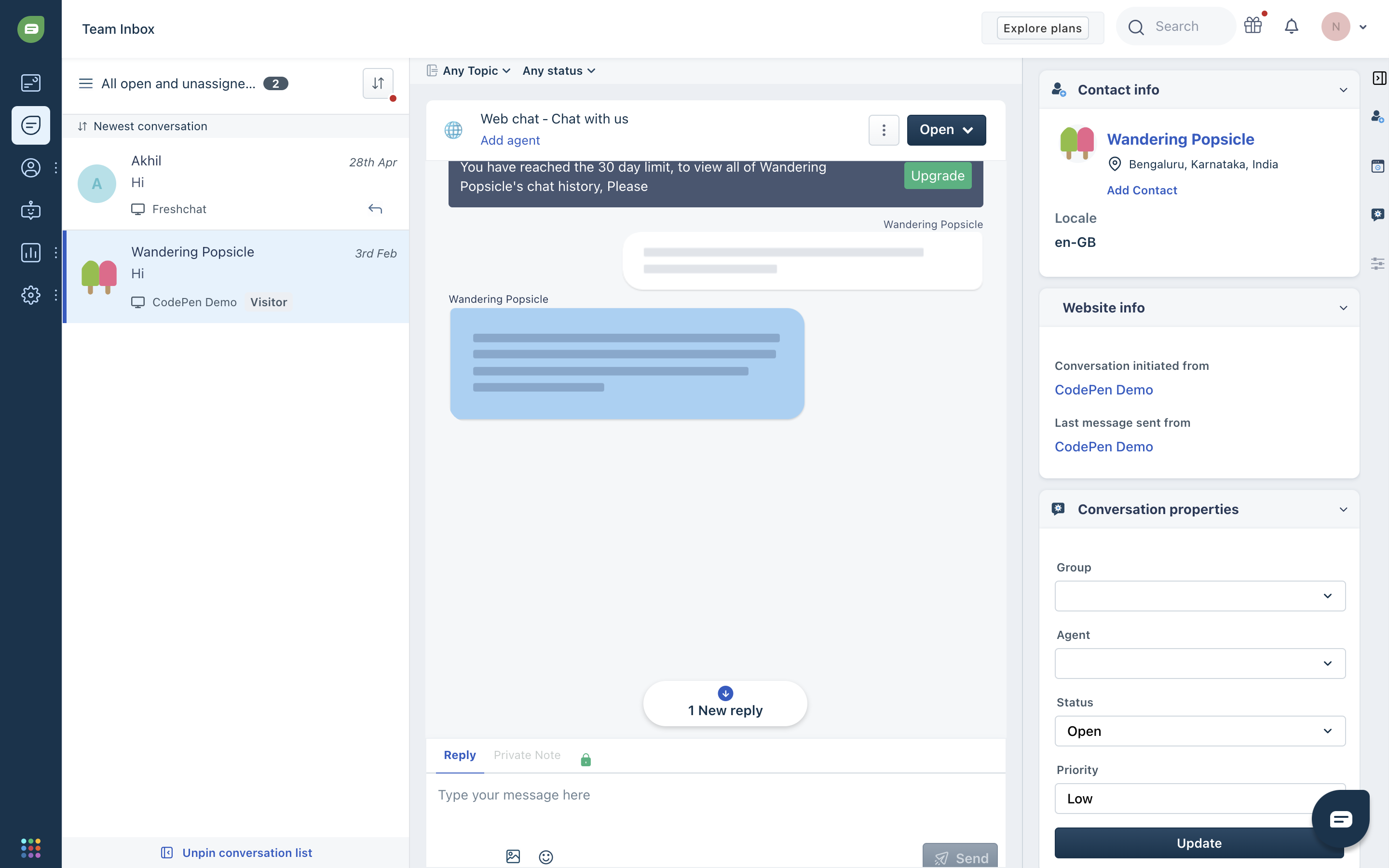
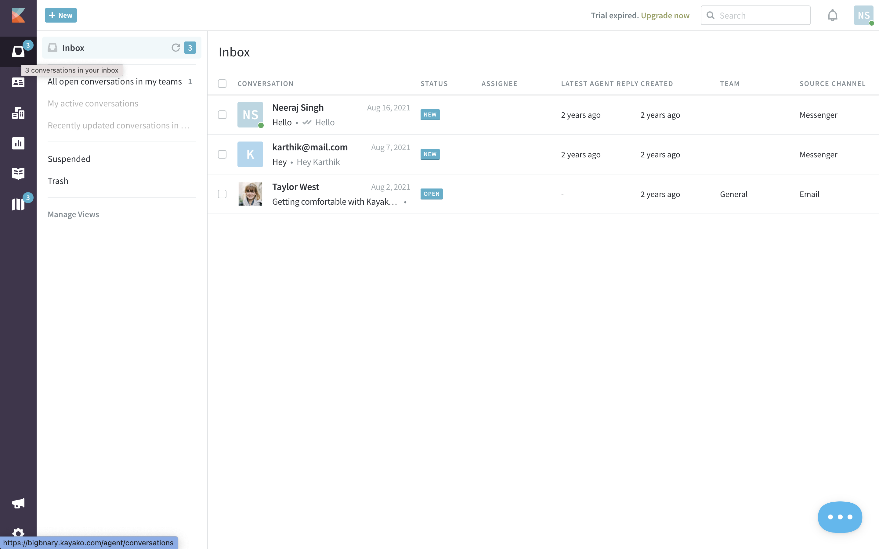
Exploring Sidebar implementations in popular chat products
I have checked and noticed that several popular chat products, including Intercom, Kayako, and Freshchat, are utilizing a similar Sidebar to the one we are currently using.
Intercom
Freshchat
Kayako
Conclusion
In my opinion, the existing UI is more scalable and compact as compared to the new UI.